Posts

23/8/2014: Real Cost of Capital: Euro 'Periphery' Dilemma

Image
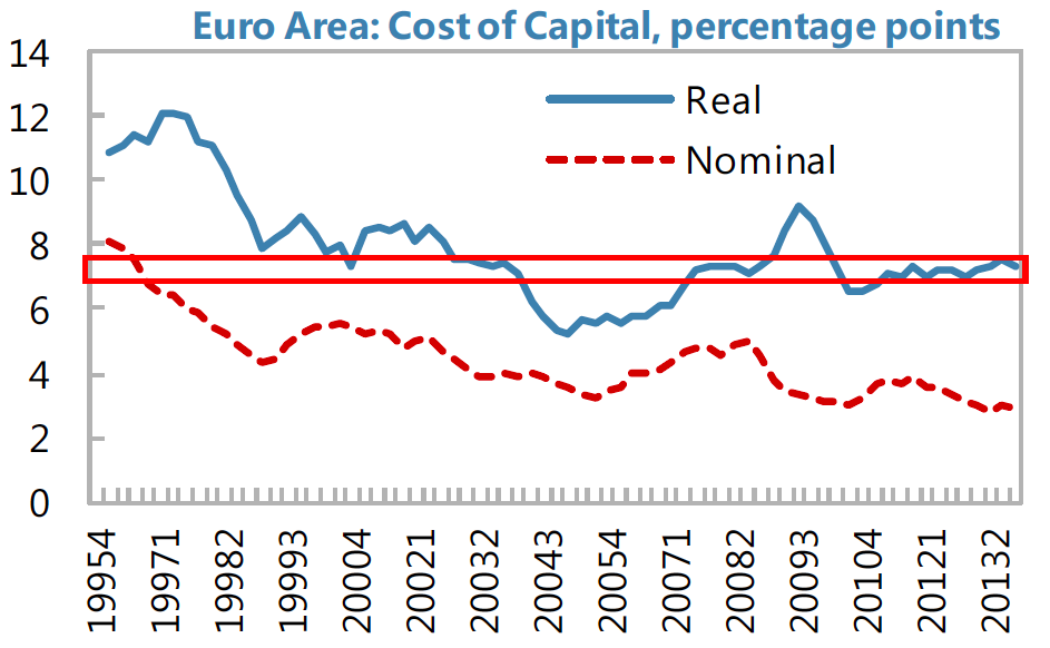
Staying on the topic of debt (see earlier post: http://trueeconomics.blogspot.ie/2014/08/2382014-that-pesky-problem-of-real-debt.html ) here is IMF research on real cost of corporate capital (linked to the cost of debt) in the Euro area 'periphery' (this is from an IMF July 2014 publication that accompanied its Article 4 paper on Euro Area). I highlighted with the red the range of recent capital costs range in each country to trace out historical comparatives. Starting with the Euro area  as a whole: Two points: Current real cost of capital across the euro area is relatively benign, compared to both 1990s - early 2000s period and shows low volatility in recent (crisis) years post 2009 peak 2009 peak is pronounced but moderate compared to the one found in some 'peripheral' countries. In basic terms, this means that euro area's capital costs are benign - above the 2004-2007 trough, but historically well below those observed in the 1990s. Spain:  Two points: Current ca...

23/8/2014: That Pesky Problem of Real Debt...

Image
Again, revisiting IMF's Article 4 consultation paper for Euro Area, published in July 2014, here is a summary of the Euro area 'peripheral' countries debt overhang. First real economic debt (debt of non-financial companies, households and public sector):  Points of note: Ireland's debt overhang is severe. More severe than of any other 'peripheral' country. Bet you forgot that little bit with all the 'best-in-class' growth performance droning in the media. Ah, and worse, remember, not the level alone, but the rate of debt increases over time, also matters. And by this metric, we too are the worst in the group, both for debt increases on 2003 levels and debt increases on 2008 levels. Ireland's households' debt has declined over 2008-2013, more so than in Portugal and Spain. But it remains second highest after the Netherlands' and this decline masks true extent of debt problem because 2013 figure no longer counts household debts issued by banks ...

23/8/2014: Labour Costs and Euro area's myth of 'productivity' gains

Image
Looking back at July 2014 IMF Article 4 paper on Euro area (most of which I covered back when it was published), here is an interesting chart mapping changes in the euro area countries' unit labour costs. The chart is complex, so let me point out few things in it: Firstly: improvements in the unit labour costs (ULCs) is reflected in the vertical distance between the black dot (accumulated change in ULCs over 2000-2007 period: higher level of the dot reflects lower competitiveness or higher ULCs compared to EA17 levels) and the black bar (accumulated change in ULCs over 2008-Q3 2013 period). This shows that Ireland has delivered (a) the highest ULCs deterioration of the sample of countries reported over 2000-2007 period, and (b) since 2008, Ireland has delivered the largest improvement in competitiveness (ULCs drop) of the sample.  Second largest improvement in ULCs was recorded in Greece and it is comparable to, but modestly shallower than in Ireland; third and virtually indistingu...

Did Someone Skin a Bigfoot at Bluff Creek?

Image
Was there a massacre at Bluff Creek? M.K. Davis originally brought up this theory called the "Bluff Creek massacre" theory back in 2008 at a Bigfoot conference. The controversial theory was immediately rejected by the Bigfoot community and Davis was shunned from ever speaking about it again -- at least for a while. According to Davis, based on his expert film analysis and color enhancements of clips from Roger Patterson, he theorizes that the Patterson party had been to the Bluff Creek site at least once, before returning to capture their famous Bigfoot footage. His theory also suggests that the party probably murdered a family of Bigfoots and buried their bodies. Davis points to an enhanced anomaly resembling a bloody dog print, a pool of blood and even a skinned Bigfoot as proof of his theory. Read more »

23/8/2014: Two charts: US Oil

Image
Two charts for trend spotting: First one shows US production of oil from 1983 through today: This shows the reversal of the 45% decline in oil output suffered from 1984-1986 through 2008 in just a few years (2009-present). The second one maps development of oil pipelines network in the US to match this expansion of production and re-orient infrastructure toward exports: That's shale & sands impact in just two charts...

Bigfoot Standing Up And Running Into the Forest?

Image
We're beginning to see a lot of footage these days from people driving (or skating ) down the road. This type of sighting is actually pretty typical, and now that everyone basically carries a cellphone camera around with them, it's only a matter of time until we get a clear shot of Bigfoot. Here's an interesting footage from Northern Ontario. According to the uploader, the creature got up and "ran" into the forest: Read more »

23/8/2014: BlackRock Institute Survey: EMEA, August 2014

Image
BlackRock Investment Institute released the latest Economic Cycle Survey results for North America and Western Europe (covered here: http://trueeconomics.blogspot.ie/2014/08/2382014-blackrock-institute-survey-n.html ). Here are the survey results for EMEA: "…this month’s EMEA Economic Cycle Survey presented a mixed outlook for the region. The consensus of respondents describe Croatia and the Ukraine in a recessionary state, with an even split of economists gauging Russia, Hungary and Turkey to be in a recessionary or contraction phase." 6 months out: "Over the next two quarters, the consensus shifts toward expansion for Russia and Hungary and an even split between expansion or recession for Turkey." 12 month out: "At the 12 month horizon, the consensus expecting all EMEA countries to strengthen or remain the same with the exception of Russia, Hungary, Turkey and the Ukraine." Global: "Globally, respondents remain positive on the global growth cycle w...